There are several types of chart types in the financial markets. The most popular types of charts are the candlesticks, bar charts, and the line charts.
The candlesticks are usually preferred by most traders because of the significant information that they offer. Bar charts are not popular while line charts are mostly used to show the direction of a trend.
In addition to these three, other types of charts are, among others:
- Kagi
- Heikin Ashi
- Area
- Point and Figure
- Range
- Renko
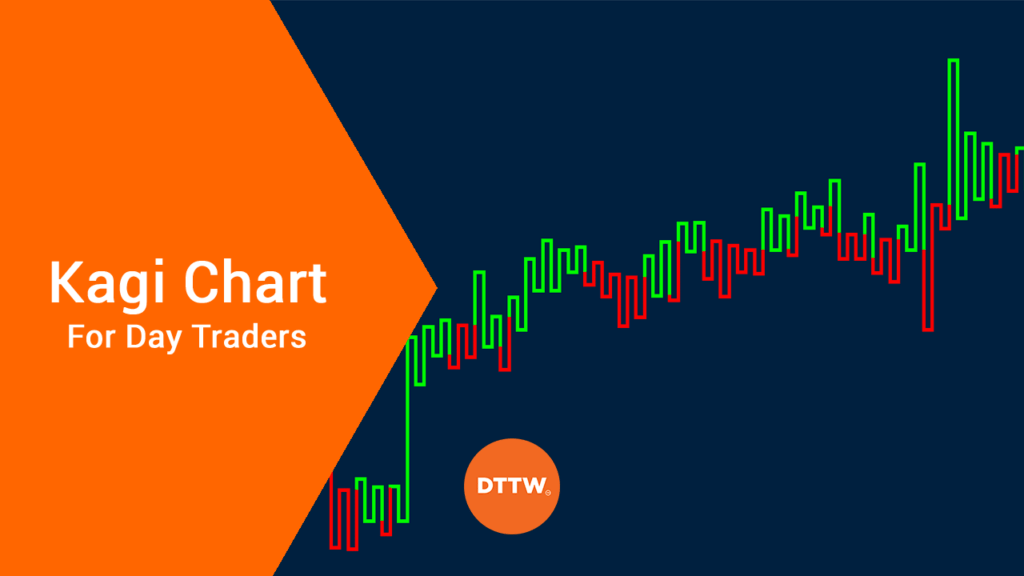
In this report, we will look at the kagi charts and how you can use them to spot trading opportunities.
Table of Contents
What is a Kagi Chart?
Like most tools used in the financial market today, kagi charts originated in Japan in the 19th century. They are also known as the hook chart and string chart. Indeed, kagi is a Japanese word for an L-shaped key.
The chart is used to illustrate the various levels of supply and demand. To read them, traders look at the specific thickness of the lines. If the price continues to move in the direction of the previous kagi line, it extends the line.
If it reverses, like it always does, a new kagi is drawn in the next level and in the opposite direction. This is unlike a candlestick, which changes depending on the period used.
The Tickness
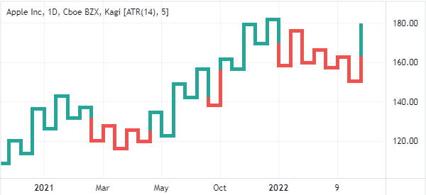
Another important aspect of the kagi is that it’s thickness tends to change when it penetrates the previous day’s low or high. In trading, the thick line is known as the yang line while the thin one is known as the yin.
The chart below shows how a kagi chart looks like.
Reading the Kagi lines
Kagi lines are not found in most trading platforms. That is because, in reality, only the most advanced traders use them in trading. Instead, if you use MT4 or MT5, you can download it from the marketplace manually. You can find it in TradingView, which is a popular charting platform.
Also, unless you are an advanced trader, you don’t need to know how the lines are drawn. Instead, you just need to know how to apply them in your charts.
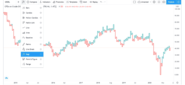
The chart below shows how you can add the kagi chart on TradingView.
What does the Kagi chart tell you?
Unlike other chart types like candlesticks and bar charts, Kagi tells traders when a reversal has happened. For example, as shown below, the red section tells you that the Apple stock was in trouble during that time.

As We will describe below, Kagi is a relatively difficult chart to use especially for traders without vast experience in the industry. That’s mostly because of the difficulty of identifying support and resistance.
How to use: kagi chart strategies
There are several trading strategies for using the kagi line. The most common approach is to buy when the kagi line moves from thin to thick (yang).
As We mentioned above, the kagi line gets thick when the previous high is exceeded. Similarly, you should short the asset when the line moves from thick to thin. This trading strategy is known as buying on yang and selling on yin.
Shoulders and waists in Kagi
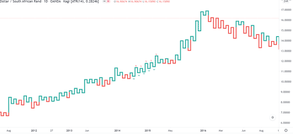
Another kagi trading strategy is known as shoulders and waists. A shoulder is the previous high while the waist is the former low. In general, when the kagi forms a series of consecutive shoulders and waits, it sends a signal of the strength of the underlying trend.
It is worth noting that the kagi chart cannot be used to analyse mutual funds because their prices are usually based on the closing prices.
Kagi, on the other hand, is based on the open, high, low, and closing (OHLC) prices. The chart below shows the shoulders and waists pattern in action.
Trend Following
Another strategy is known as trend following. In this, you basically look at the direction the kagi is trading in and follow the trend. If it is showing consecutive greens, it is a sign that bulls are in control and that you can buy.
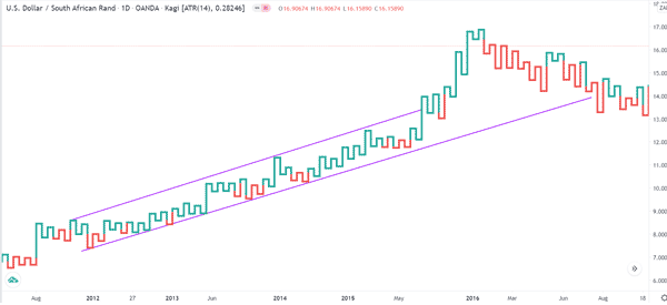
Similarly, if it shows a series of red kagis, it is a sign that bears have prevailed, which means that you can short it. Like in candlesticks, you can also use channels to trade the kagi as shown below.
Technical Indicators
Finally, like in the candlestick patterns, you can also use technical indicators to trade the kagi pattern. A popular approach is to use the 15-day moving average to validate a trend. As shown below, the kagi remains above the moving average so long as the price is ascending.
Other indicators you can use with the kagi are Bollinger Bands and the Envelopes.
Kagi vs candlesticks
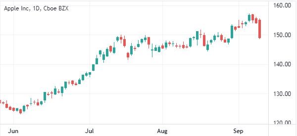
Kagi and candlesticks are parallel with one another, meaning that they have no close resemblance. The candlestick chart shows a trader everything that they need to know about the asset. In other words, it has a OHLC (Open, High, Low, and Close).
Therefore, by looking at these numbers, you will be at a good position to understand the current price action. The chart below shows how a candlestick looks like.
Kagi vs Renko
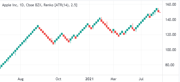
Renko charts, on the other one, differ from Kagi and candlesticks in that they use price movements instead of price and standardized time intervals. As such, it removes this noise and creates a chart that shows the direction of an asset as shown below.
Final thoughts
The kagi is not a popular chart pattern. Indeed, it is only used by highly advanced traders. But, it is also one of the easiest to use when you understand it well!
Before you use it, we recommend that you take time to read more about it. Beyond candlesticks, a popular book by Steve Nison is a good starting point. In addition to that, you should take time to test it in a demo account.
External Useful Resources
- What is Kagi Chart and How to Use in Forex? – Pipbear


